The general definition of composition is "The combining of distinct parts or elements to form a whole."
This however is also true for the composition of artwork. To create a brilliant and effective piece of artwork you have to consider many different elements to make it draw in the viewer and leave an impression.
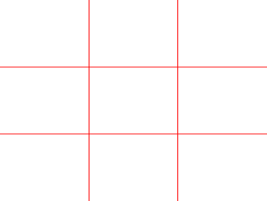
One way is to follow the rule of thirds. The rule of thirds is to divide an image within a 3 by 3 grid.
By lining up interesting elements of the image to the lines of the grid. This helps to create a balanced and pleasing composition. The points which overlap are known as power ponits and elements overlapping these areas draw our eye. It is also used in photography and on digital cameras there is usually the option to display this grid upon the screen to assists the photographer. Artists as well can create a simple grid using card and string which they can carry round with them to check the composition of the area they want to draw.
As with this photo its composition works well as we are drawn to the face then our eyes follow the curve of its spine to the end of its tail.
Another rule artists follow is the rule of space. Its another simple technique of simply adding negative space in front of an element of the image that is moving. For example in front of someones face or in front of a moving vehicle gives it a sense of movement.
Another idea is that even number of objects within an image is comforting to us as the eye pairs objects together. Yet within the rule of odds if there is 3 objects in the scene, the middle one becomes more interesting. Also because this object is flanked by a pair of the same object it feels non threatening.
Cezanne pyramid of skulls
Another technique is called the golden triangle. Its having the main points of the image being in each corner of the triangle. It divides subjects within the image equally but keeping the focal point.
There is also the Golden Mean or Ratio a calculation which help us divide up the composition. The focal point being the closest area to the center of the swirl whilst other elements following the curve of the line.
Having elements in a scene overlapping is often more interesting than if they are just touching. This could be possibly because the mind creates whatever is being hidden and makes us think more.
Colour is a great way to help the composition of an image. By limiting your colour pallet and having the focal elements in a contrasting colour makes them stand out and draw our eye. If there are two any colours the eye doesn't know where to concentrate and we lose focus.
Using Monet water lilies painting as an example you can see how he makes the lilies stand out from the water and drawing your eye by the difference in colour.
Colours can also be used to portray the mood of the image. Darker tones can create great lighting effects and drama, whilst bright colours will make the paintings feel happier and brighter.
Keeping all these elements in mind whilst creating an image is mind boggling but simply using a few will make the image much more effective.


No comments:
Post a Comment