Have you ever wondered what makes certain levels in games more memorable or enjoyable, its likely due to good design. Companies go through many processes to create a well designed level. Though the level has to be designed with the games functions in mind such as if it is a shooter, plat-former or role-playing game,it will require different style levels.


Its after this stage that artists can then begin to concept in more detail to the level and design the assets that may fill them. This then leads to further block outs and tests until the overall design for the level is complete.
Many good levels are designed with secret areas. These areas the player will go out of there way to find but will be rewarded for finding. This makes the level feel more exploratory and makes the player check every nook and cranny to make sure they haven't missed anything. Another way to make the level feel more exploratory is to give many diverging paths instead of one long corridor. But an even more interesting mechanic can be giving options within certain areas of a room. This was used very well in the Stanley Parable. Just by rewarding the player with dialogue the player can retry certain; almost insignificant decisions; such as pressing buttons or not doing so to see what will happen as they know they will likely be rewarded for doing either but each giving a different result.
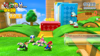
Its a good idea at this point to also ensure that there is diversity within the level so that its not repetitive and boring. Having certain areas for battling, others to complete puzzles to advance in the level, cut-scenes ect. Yet too much diversity can ruin the game-play, swapping quickly from say driving a car, to a puzzle then horse riding will ruin the flow and confuse the player. A good way to ensure your not going off the rails with random activities it to make sure your just staying to the core mechanics of the game. A great example of this is the new Mario 3d world. All the levels are unique and scale in challenge but there are secret areas that lead to extra puzzles for prizes, such as collecting coins, racing or rolling balls. Yet not only that within the level itself different areas require the player to do different things such as platforming to defeating a boss and it doesn't get boring.
Even then games can sometimes get repetitive but the player will undergo these repetitive actions to gain a reward. For example grinding for levels in an rpg to then progress the story or to gain a piece of legendary armor. As long as their is an obvious goal for the players repetitive actions they will be seen as acceptable for and complete them regardless even though they may not be enjoyable.
So overall levels should be blocked out to ensure they work well, ensuring they are exploratory and secret areas for the player to find and be rewarded with, and blocking out areas of the levels to be different things such as puzzles or boss areas to diverge gameplay.
Most levels during early development go through a stage of simple boxing out areas with checkered textures. With each checker having a cubic measurement representing the characters height or jumping ranges. This then gives the team chance to test the levels and see if the generally work with the characters animations and limitations and whether the level is interesting enough.


Many good levels are designed with secret areas. These areas the player will go out of there way to find but will be rewarded for finding. This makes the level feel more exploratory and makes the player check every nook and cranny to make sure they haven't missed anything. Another way to make the level feel more exploratory is to give many diverging paths instead of one long corridor. But an even more interesting mechanic can be giving options within certain areas of a room. This was used very well in the Stanley Parable. Just by rewarding the player with dialogue the player can retry certain; almost insignificant decisions; such as pressing buttons or not doing so to see what will happen as they know they will likely be rewarded for doing either but each giving a different result.
Its a good idea at this point to also ensure that there is diversity within the level so that its not repetitive and boring. Having certain areas for battling, others to complete puzzles to advance in the level, cut-scenes ect. Yet too much diversity can ruin the game-play, swapping quickly from say driving a car, to a puzzle then horse riding will ruin the flow and confuse the player. A good way to ensure your not going off the rails with random activities it to make sure your just staying to the core mechanics of the game. A great example of this is the new Mario 3d world. All the levels are unique and scale in challenge but there are secret areas that lead to extra puzzles for prizes, such as collecting coins, racing or rolling balls. Yet not only that within the level itself different areas require the player to do different things such as platforming to defeating a boss and it doesn't get boring.
Even then games can sometimes get repetitive but the player will undergo these repetitive actions to gain a reward. For example grinding for levels in an rpg to then progress the story or to gain a piece of legendary armor. As long as their is an obvious goal for the players repetitive actions they will be seen as acceptable for and complete them regardless even though they may not be enjoyable.
So overall levels should be blocked out to ensure they work well, ensuring they are exploratory and secret areas for the player to find and be rewarded with, and blocking out areas of the levels to be different things such as puzzles or boss areas to diverge gameplay.


