Sunday 22 December 2013

Level Design

Have you ever wondered what makes certain levels in games more memorable or enjoyable, its likely due to good design. Companies go through many processes to create a well designed level. Though the level has to be designed with the games functions in mind such as if it is a shooter, plat-former or role-playing game,it will require different style levels.
League of legendsFinal Fantasy 13:lighting returns Titanfall                                              
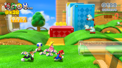
Super Mario 3D world


Most levels during early development go through a stage of simple boxing out areas with checkered textures. With each checker having a cubic measurement representing the characters height or jumping ranges. This then gives the team chance to test the levels and see if the generally work with the characters animations and limitations and whether the level is interesting enough.  

Its after this stage that artists can then begin to concept in more detail to the level and design the assets that may fill them. This then leads to further block outs and tests until the overall design for the level is complete.
Many good levels are designed with secret areas. These areas the player will go out of there way to find but will be rewarded for finding. This makes the level feel more exploratory and makes the player check every nook and cranny to make sure they haven't missed anything. Another way to make the level feel more exploratory is to give many diverging paths instead of one long corridor. But an even more interesting mechanic can be giving options within certain areas of a room. This was used very well in the Stanley Parable. Just by rewarding the player with dialogue the player can retry certain; almost insignificant decisions; such as pressing buttons or not doing so to see what will happen as they know they will likely be rewarded for doing either but each giving a different result.

 Its a good idea at this point to also ensure that there is diversity within the level so that its not repetitive and boring. Having certain areas for battling, others to complete puzzles to advance in the level, cut-scenes ect. Yet too much diversity can ruin the game-play, swapping quickly from say driving a car, to a puzzle then horse riding will ruin the flow and confuse the player. A good way to ensure your not going off the rails with random activities it to make sure your just staying to the core mechanics of the game. A great example of this is the new Mario 3d world. All the levels are unique and scale in challenge but there are secret areas that lead to extra puzzles for prizes, such as collecting coins, racing or rolling balls. Yet not only that within the level itself different areas require the player to do different things such as platforming to defeating a boss and it doesn't get boring.


 Even then games can sometimes get repetitive but the player will undergo these repetitive actions to gain a reward. For example grinding for levels in an rpg to then progress the story or to gain a piece of legendary armor. As long as their is an obvious goal for the players repetitive actions they will be seen as acceptable for and complete them regardless even though they may not be enjoyable.
So overall levels should be blocked out to ensure they work well, ensuring they are exploratory and secret areas for the player to find and be rewarded with, and blocking out areas of the levels to be different things such as puzzles or boss areas to diverge gameplay.

Wednesday 4 December 2013

Visual Composition

The general definition of composition is "The combining of distinct parts or elements to form a whole."
This however is also true for the composition of artwork. To create a brilliant and effective piece of artwork you have to consider many different elements to make it draw in the viewer and leave an impression.

One way is to follow the rule of thirds. The rule of thirds is to divide an image within a 3 by 3 grid.
By lining up interesting elements of the image to the lines of the grid. This helps to create a balanced and pleasing composition. The points which overlap are known as power ponits and elements overlapping these areas draw our eye. It is also used in photography and on digital cameras there is usually the option to display this grid upon the screen to assists the photographer. Artists as well can create a simple grid using card and string which they can carry round with them to check the composition of the area they want to draw.
As with this photo its composition works well as we are drawn to the face then our eyes follow the curve of its spine to the end of its tail. 

Another rule artists follow is the rule of space. Its another simple technique of simply adding negative space in front of an element of the image that is moving. For example in front of someones face or in front of a moving vehicle gives it a sense of movement. 

Another idea is that even number of objects within an image is comforting to us as the eye pairs objects together. Yet within the rule of odds if there is 3 objects in the scene, the middle one becomes more interesting. Also because this object is flanked by a pair of the same object it feels non threatening. 
Cezanne pyramid of skulls

Another technique is called the golden triangle. Its having the main points of the image being in each corner of the triangle. It divides subjects within the image equally but keeping the focal point.
There is also the Golden Mean or Ratio a calculation which help us divide up the composition. The focal point being the closest area to the center of the swirl whilst other elements following the curve of the line.


Having elements in a scene overlapping is often more interesting than if they are just touching. This could be possibly because the mind creates whatever is being hidden and makes us think more. 

Colour is a great way to help the composition of an image. By limiting your colour pallet and having the focal elements in a contrasting colour makes them stand out and draw our eye. If there are two any colours the eye doesn't know where to concentrate and we lose focus.
Using Monet water lilies painting as an example you can see how he makes the lilies stand out from the water and drawing your eye by the difference in colour.

Colours can also be used to portray the mood of the image. Darker tones can create great lighting effects and drama, whilst bright colours will make the paintings feel happier and brighter. 
Keeping all these elements in mind whilst creating an image is mind boggling but simply using a few will make the image much more effective.

Monday 2 December 2013

Planning and Concepting

As a wannabe game artist, making sure I get all my work done and to the best standard is a struggle. Time management and keeping on top of everything can be very challenging and I'm often one to accidentally fall behind. Yet two things that make life a lot easier is planning out schedules and jotting down ideas before jumping to the end result.

Mood boards can be a great way to gather information and ideas for projects. Seeing things that have already been created under the same theme and using already existing and working creations to ensure yours will work realistically to can be a great help. Even finding images off topic that you find inspiring and would like to use in your work could make it unique. A good website to quickly gather images is flickr. It allows you to organised them into folders and you can quickly scroll through your collection to gain the inspiration you need. By organizing your images you can also group them by colour.

Sketches and initial concepts are invaluable. Not only do they give you ideas for final outcomes but also others can look at them and see your thought processes. Silhouettes are essential in the first part of design. Just by gaining the initial shape and feel of a character, object or vehicle you will be able to tell if it will be successful. It also then allows you to add in more detail to them and find the best design for it.

Once you have the basic outline and specific design you then should start adding values and lighting. Theses are usually the core shadow, cast shadow, main light and bounce light.Its only once you have these values worked out that you can then begin to think about colour as if your values are incorrect the colour won't layer well over it. Also consider the texture and feel of different elements so they are represented correctly.
Then you can begin to finalize your design and add in the details.


If you jump straight to adding in detail different elements will be different qualities and may not work to the correct lighting you decided for the scene. But its an easy thing to do but can ruin your final outcome. So by using references, silhouttes, further design and sketches, and ensuring your overall values are correct in your final outcome will keep the standard of your work high.
My final concept for my air sea and land vehicle after following these steps.

Sunday 20 October 2013

My first week back

So the course has changed quite a bit. Not only because I am now a second year student but also because the course was moved to a whole new building with new lecturers to boot. With a syntec tablet suit, new life drawing, modelling rooms and labs. There is a lot more room to work in.

For game production our first project is to create a scene of trash. We were then given tutorials on projection mapping and how to efficiently use it. Which was something I continuously wanted to be shown the year previously but was never given the opportunity to. We also began trying to use the cloth modifier to create bin bags. On top of that I was able to quickly get back into using 3ds Max, so overall game production seems to be going well.


For my first weeks visual design project I had to draw at abbey park. On top of creating traditional thumbnails we also had to create digital ones. Moving into colour was quite a big step for me as I'm not very clued up on picking the right tones.
So I began with my traditional sketches.


I then moved on to digitizing my sketches.

For my final I wanted to experiment with turning a grey scale into colour. So I picked the top grey scale thumbnail to try and colour and refine.


There are still extra details I need to add to it. It also probably needs more contrast. But I have a lot of fun experimenting with layers and creating my own brushed with this piece so I still find it successful even though it may not be visually pleasing. I may go back and do a second final for the project based on another thumbnail. But for now I need to move on.

Thursday 17 October 2013

Another look back

So after a very long summer, and disappointing results I've had to reflect quite a bit on my first year. I always knew that my game production was the weakest subject but I was a little surprised by my similar marking in visual design as that's where I felt I was stronger.  I think it comes to my summer slump where I wasn't trying as hard and completing work just to complete it and not putting my whole effort into it.

One such example could be my weapon project.


The aim was to create a post apocalyptic weapon from scrap that we find. With the help of some friends I used an umbrella, old parts of circuits, a broken drill and a snowball maker. I didn't do many designs for the weapon and simply assembled all the objects together. This then made it difficult to model in 3d as I had mainly taped things together and due to the lack of much colour other than orange it wasn't overall very impressive. 

So some of my 3rd term work didn't turn out as well as I would have liked. Yet generally I think I progressed a lot in my first year. I'm specifically proud of my 3 hour museum final. I know I wouldn't have been able to draw the same thing to the same standard. I've improved a lot on my contrast which is something I struggle with a lot. I'm also proud of my two point perspective final and my 3d building project.


These 3 pieces of work I would never have been able to accomplish without the course, or at least as quickly as I did. I want to continue to keep accomplishing things on the course that I otherwise wouldn't be able to, and strive to do even better this year. In order to do that I want to improve my 3d skills. Learning about projection mapping will help me create better textures for my models. And I also want to learn how to use Z brush to create my high poly models.
For my visual design I want to try to get better at photoshop as it is something I struggle with.Digital painting will become a big part of the year so i need to become comfortable using it efficiently.

Over the summer I tried to stay productive and do work but it didn't end well. I was quite unproductive so I'm going to make sure I stay productive and complete all my projects on time and not rush them.So stay posted to see how things go.

Tuesday 21 May 2013

Personal review of my first year

Its weird to think that my first year is coming to an end. It seems to have flown by. Fighting through the loads of work has had results though. At times it felt as though I was making no progress but now I can really see how much I have improved. And this was due to some of the great curriculum.

In the first term I was taught basic skills that during my time at sixth form was never once explained to me. Perspective basics, rendering techniques and composition. Silly stuff like that I shouldn't use HB pencils for rendering even though in sixth form I was specifically told to use them and nothing else. I have issues with contrast in my work and often I'm too afraid to commit to tone, but I'm slowly gaining confidence in my rendering and improving my work.

My favourite projects were the ones where we had to go out and draw. It meant I was having to leave and go out. When I'm stuck in my room I often find distractions but when I'm out drawing I'm able to concentrate for much longer periods and get a lot more work done and improve faster. I really enjoyed the museum rendering projects. As one we were indoors, drawing interesting things though surrounded by noisy children it was a very memorable project. All the random times we had to go out and draw and strangers would ask us about our work, some strangers being stranger than others but all these experiences are great memories that i likely would not have experienced on any other course.


Some of the weirdest things I saw was at the archway with film crews and models showing up and confusing me.

Yet some of the more difficult things for me to try and do was to design. I know its silly. I'm trying to be a designer and to be able to create great scenes, yet when it came to designing a vehicle or character based off a real person I quickly went off route and didn't know where to take it exactly. The scope was so broad that I could have designed almost anything I wanted but this made me waste time trying to work out so many possibilities, in which case I would have preferred to have more restrictions placed upon me. This improved however later in the year where we were given the coral reef character and 70s character which were much more specific.


It was difficult to design a character as I had no idea how to tweak them to make them interesting

The first term of game production also started really well. Difficult as we were dropped into the deep end but it was a great learning curve. As the weeks progressed I was able to look at past work and see where I was making mistakes and how to correct them. Yet in the later terms there were certain techniques such as baking normal's using high poly models and using Z brush to create them. I still have no idea how to do this and really want to learn how to but have been given no opportunity or optional extra blackboard pdf tutorials that might cover it. 

Another project I enjoyed but found difficult because of a lack of tutorials was creating a scene in UDK. With only an introduction on how to import assets and turn them into packages we were then left to our own devices. I got very confused with opening my levels as I was always greeted with error messages as it could not find the packages and all my work wouldn't show up. Yet all I needed to do was import my packages before opening the level but I wasn't told this and was left stranded for a week until I could get help. So I wish we could have had more UDK tutorials on making terrains and how to navigate and save our levels and packages correctly. And I have no idea what baking lighting is.

I had so many issues with UDK and it was often silly mistakes like here I just hadn't saved the material.

Yet using UDK was a great project. It allowed us to look over our work so far and see how good / bad it was in a game engine and how specular and bump maps can really make a difference on an asset. 

Lastly I'm really glad we were given the opportunity to do presentations as I personally don't enjoy doing them so the practice is very useful even though I dread doing them. Supposedly I'm getting better at them so practice makes ... me less likely to have a panic attacks.

So its been a great year on the course and I think I have improved a great deal. I'm still struggling with my 3D and certain elements of my visual design but I plan on practicing over the summer and improving for next year. A lot of things have changed for me over the past year so I'm very glad for this course keeping me looking forward and helping me improve exponentially. 

Wednesday 24 April 2013

Life drawing

I had done a little life drawing before going to university. A group of local artists where I lived organised to meet on Thursdays during summer and draw. When I first joined however I did not know about the positioning rules and had to try and tackle for shortening off the bat and it didn't end well. Yet the practice helped me a lot and made me a little more confident when starting life drawing at university.


Beginning each session with quick sketches and contours practice without looking at the paper and drawing with your opposite hand was completely new to me however. It helped me try to quickly get her form down on paper.


Using charcoals, inks and chalks was also new to me and great to experiment with. Tough messy each give a very unique effect on the paper.

Charcoal extrusion work was also very new to me, but a very fun was of working. Allowing the artist to continually add and take away values made the process very fun and gave a completely different effect. Also allowing me to get a better understanding of shadow and highlights as I struggle quite a bit with them.


 I'm slowly beginning to understand proportions and for shortening but I'm still making many mistakes and working to slowly.Hopefully that will all come with practice.